21/04/2025 - 11/05/2025 / Week 1 - Week 3
An Hongzheng / 0378415
Advanced Typography / Bachelor of Design (Honours) in Creative Media / Taylors University
Task 1 : Exercises
CATALOGUE
LECTURES
Week 1 :
AdTypo_1_Typographic Systems
8 Major Variations:
- Axial
- Radial
- Dilatational
- Random
- Grid
- Modular
- Transitional
- Bilateral
The typographic organisation is dependent on communication, and it's important to confirm that communication is at the forefront of the form. Additional criteria include hierarchy, order of reading, legibility, and contrast.
1. Axial System
All elements are organised to the left or right of a single axis. The axial can be bent and uses more than a single line.
2. Radial System
All elements are extended from a point of focus. It can have multiple points of focus.
3. Dilatational System
All elements expand from a central point in a circular fashion. You can have multiple rings and place the elements based on the reading rhythm or hierarchy. It can be simple or complex.
4. Random System
Elements appear to have no specific pattern or relationship.
5. Grid System
A system of vertical and horizontal divisions. It's common because everyone is using it.
6. Transitional System
An informal system of layered banding. It can be applied to a book layout, depending on when and where you use it.
7. Modular System
A series of non-objective elements that are constructed as a standardised unit. You can shift the order of the elements as long as the units' sizes are the same. The point of this system is that you can move your elements, but they must be in the same grid system, inside the border and the cell.
8. Bilateral System
All text is arranged symmetrically on a single axis. It might be boring based on how you use it.
Week 2 :
AdTypo_2_Typographic Composition
Principles of Design Composition:
- Emphasis
- Isolation
- Repetition
- Symmetry & Asymmetry
- Alignment
- Perspective
The Rule of Thirds:
A 3*3 grid, the intersecting lines are used as a guide to place the points of interest. This is generally not used in typography composition, but it's still an important element of composition.
Typographic Systems:
Out of all 8 systems, the grid system is mostly used which is derived from the grided compositional structure of letterpress. It is also known as the Swiss (Modernist) style typography in modern days.
Other Models / Systems:
Environmental Grid:
Exploration of an existing structure and numerous structures combined.
Form and Movement:
This exploration transforms grid systems by challenging their formal constraints, envisioning book pages as a slow-motion animation. By strategically placing forms across multiple pages, the static grid evolves into a dynamic, moving design, creating a unique visual experience.
Week 3 :
AdTypo_3_Context & Creativity
Handwriting:
The first mechanically produced letterforms were designed to directly imitate handwriting. Handwriting is important in the study of typography because it would become the basis or standard for form, spacing and conventions that mechanical type would try and mimic.
Programmers and Type Design: Multiscript Typography:
Multiscript combines English (Latin) letters with vernacular scripts. Programmers and type designers collaborate to create cohesive fonts, addressing technical challenges like Unicode compatibility and rendering, while ensuring cultural sensitivity and visual harmony between scripts.
Local Movement and Individuals:
Designers should examine their cultural histories, civilizations, and communities to inform future-focused designs. Inspiration comes from observing surroundings and exploring collective pasts, rooting creativity in local heritage.
Week 4 :
AdTypo_4_Designing Type
2 reasons for designing a typeface by Xavier Dupre (2007):
1. Type design carries a social responsibility, so one must continue to improve its legibility
2. Type design is a form of artistic expression
1. Frutiger by Adrian Frutiger
 |
Figure 1.5 Frutiger by Adrian Frutiger / Week 4 (14/5/2025)
|
- Designed by the Swiss type designer Adrian Frutiger in 1968, specifically for use in the French airport.
- The purpose is to create a clean, distinctive and legible typeface that is easy to see from both close up and far away.
- Consideration / Limitations: Letterforms needed to be recognized even in poor lightings, or when the reader was moving quickly past the sign.
2. Verdana by Matthew Carter
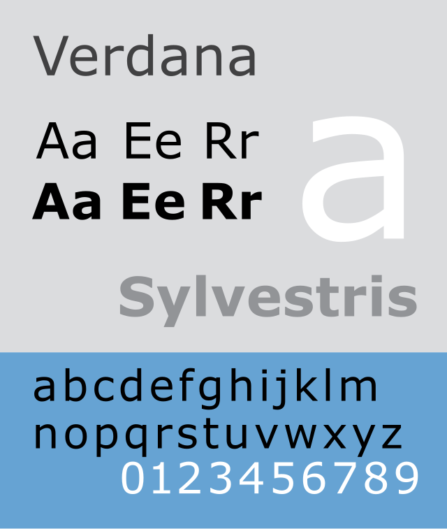 |
Figure 1.6 Verdana by Matthew Carter / Week 4 (14/5/2025)
|
- Designed by Matthew Carter to address specific technical challenges.
- The purpose is to be extremely legible even at very small sizes on the screen due in part to the popularity of the internet and electronic devices.
- Consideration / Limitations: Verdana exhibits characteristics derived from the pixel rather than the pen, the brush or the chisel.
3. Johnston Sans by Edward Johnston
 |
Figure 1.7 Johnston Sans by Edward Johnston / Week 4 (14/5/2025)
|
- Designed by Edward Johnston in 1916 with a request for bold simplicity.
- The purpose is to be used as a new typeface in posters and signage on London's Underground Railway.
General Process of Type Design:
1. Research
2. Sketching
3. Digitization
4. Testing
5. Deploy
The General Process of Type Design
Type design is a systematic yet creative endeavor that unfolds across five key stages: Research, Sketching, Digitization, Testing, and Deployment. Each phase builds on the previous one, transforming an initial concept into a polished, functional typeface.
1. Research
The journey begins with a deep dive into the foundations of typography. Designers explore type history to gain context and perspective, study type anatomy to understand the structure of letters, and familiarize themselves with type conventions—the unwritten rules that guide typographic practice. Key terminologies like sidebearing (the space on either side of a glyph), metrics (measurements governing spacing and alignment), and hinting (instructions for rendering at small sizes) are essential to grasp. This stage also involves defining the typeface’s purpose—whether it’s for headlines, body text, or a specific aesthetic—and analyzing existing fonts for inspiration.
2. Sketching
With research in hand, designers start sketching to bring their ideas to life. This can be done using traditional tools like brushes, pens, ink, and paper, or digital tools such as a Wacom tablet paired with font design software. Both approaches are valid and depend on the designer’s preference, though digital sketching may sometimes constrain the organic flow of hand-drawn strokes. The goal here is to experiment with shapes and forms, laying the groundwork for the typeface’s personality.
3. Digitization
Once sketches are refined, they’re brought into the digital realm using professional software like FontLab or Glyphs App. Some designers may also use Adobe Illustrator to craft initial letterforms before importing them. During digitization, attention to detail is paramount—not just to the letterforms themselves, but also to their counterforms (the enclosed or negative spaces within and around letters), which play a critical role in ensuring readability. This stage transforms rough concepts into precise, editable glyphs.
4. Testing
Testing is a cornerstone of the design process, where the typeface is prototyped and refined. Designers evaluate readability (how easily the text can be read) and legibility (how distinguishable the characters are), tailoring their approach based on the typeface’s category—whether it’s a bold display type for headings or a subtle text type for paragraphs. Iterative adjustments here ensure the typeface performs well across different contexts and sizes.
5. Deployment
Finally, the typeface is released into the world during the deployment stage. Even with careful preparation, teething problems—minor issues not caught during testing—can emerge. Rigorous testing in earlier stages helps keep these manageable, ensuring the typeface is as polished as possible. Deployment marks the end of the design process but often the beginning of real-world feedback and potential updates.
This process blends technical precision with artistic expression, resulting in typefaces that are both practical and distinctive.
Typeface Construction:
| Figure 1.8 Typeface Construction by Ms. Modglin / Week 4 (14/5/2025) |
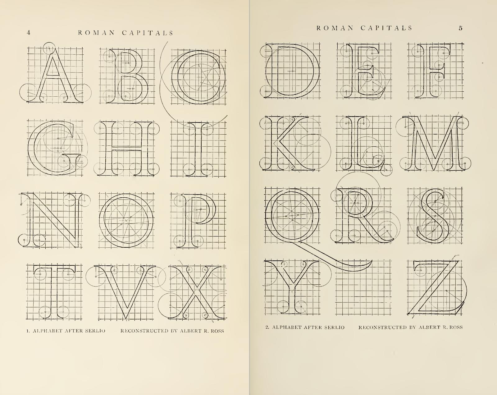
Roman Capital
The grid consists of a square with a circle inside that touches the lines of the square in four places. A rectangle with 3 quarters the size of the square is also included within the centre of the square. Using grids with circular forms can facilitate the construction of letterforms and is also a possible method to build/ design your letterform.
Construction and considerations
 |
| Figure 1.9 Classification according to form and construction / Week 4 (14/5/2025) |
The 26 characters of the alphabet can be arranged into groups depending on their form and construction, whereby a distinction is made between a group for the capitals and a group for lowercase letters.
Many different forms and constructions must be taken into account when designing a new type. Important visual correction is the extrusion of curved forms past the baseline and cap line, which also applies to vertical alignment between curved and straight forms.
Figure 1.10 Example of Fitting / Week 4 (14/5/2025)
Visual correction is used to correct the distance between letters. It is not possible to place letters next to each other with equal spacing between times, and they must be altered into a uniform visual space; also known as 'fitting' the type.
Context & Creativity
The need/ motivation of most typefaces can be intrinsic and extrinsic.
Intrinsic
- The designer seeks out a form that comes close to fulfilling a desire.
- Also possible that the designer identifies a gap/ problem and endeavours to solve it through the design of the typeface.
Extrinsic
- When the designer has been commissioned or the student-designer was given a task to complete that involves designing a typeface.
- For a designer to be successful, we need to be invested in the idea and understand the requirements, limitations, use, and stakeholders.
INSTRUCTION
Figure 2.1: Module Information Booklet / Week 1 (21/4/2025)
Exercises 1: Typographic System
For the headline of my posters, I decided to go with "All Ripped Up: Punk Influences on Design".
Content Details:
The Design School,
Taylor’s University
All Ripped Up: Punk Influences on Design
Open Public Lectures:
June 24, 2021
Lew Pik Svonn, 9AM-10AM
Ezrena Mohd., 10AM-11AM
Suzy Sulaiman, 11AM-12PM
June 25, 2021
Lim Whay Yin, 9AM-10AM
Fahmi Reza, 10AM-11AM
Manish Acharia, 11AM-12PM
Lecture Theatre 12
1. Axial
Fonts Used:
ITC New Baskerville Std(Roman, Bold)
Fig 3.1.1 Axial System, Week 2
For the axial system, the design on the left is the one I completed with Mr. Vinod to familiarize myself with basic design and techniques.
The one on the right is a new design. I think since this is an axial system design, it is better to show the line directly, and the text on both sides of the line should be arranged in an interlaced manner to make the overall design more balanced, and try to create a sense of timeline to guide the audience's eyes.
2. Radial
Fonts Used:
ITC New Baskerville Std(Roman, Bold)
Fig 3.1.2 Radial System, Week 2
For the radial system,
For both designs I chose to use just one circle because I think too many circles would affect the readability of the text.
For the design on the left, I placed the circle at the bottom left of the canvas and made the text feel like it was bursting out of the circle.
For the design on the right, I chose a more symmetrical and balanced design, like the sun and the surrounding light. The four corners of the canvas are also balanced with equal amounts of text of the same size.
3. Dilatational
Fonts Used:
ITC New Baskerville Std(Roman, Bold)
Fig 3.1.3 Dilatational System, Week 2
For the dilatational system, the idea behind both designs is very similar, I wanted to create a signaling feeling as much as possible, but the design on the right is more regular and symmetrical.
4. Random
Fonts Used:
ITC New Baskerville Std(Roman, Bold, Italic)
Fig 3.1.4 Random System Week 2
For the random system, to highlight the random feeling in the design, I used more fonts and colors, and filled part of the text box with color.
The left and right designs are arranged very randomly, but there is still a certain pattern.
The left design has the text gradually getting smaller from the upper left to the lower right.
The right design has a feeling of surrounding a circle, with the text gradually getting smaller from the outside to the inside.
5. Grid
Fonts Used:
ITC New Baskerville Std(Roman, Bold)
Fig 3.1.5 Grid System, Week 2
For the grid system, basically, the text is arranged differently according to the grid. The design on the left pays more attention to the balance between the two sides, while the design on the right deliberately leaves more space on the left side of the canvas.
6. Modular
Fonts Used:
ITC New Baskerville Std(Roman, Bold)
Fig 3.1.6 Modular System, Week 2
For the modular system,I tried two different designs.
The design on the left is almost absolutely balanced, making it feel very neat, but the use of different colors keeps the image from being too boring.
The body text in the design on the right feels like it is half-surrounded by the heading, and uses text box filling to highlight part of the text. The different lengths can create a sense of stairs.
7. Transitional
Fonts Used:
ITC New Baskerville Std(Roman, Bold)
Fig 3.1.7 Transitional System, Week 2
For transitional system, both designs use squares and straight lines to reinforce the suggestion of movement, and use gradient fill effects to enhance the feeling of movement.
8. Bilateral
Fonts Used:
ITC New Baskerville Std(Roman, Bold, Bold Italic)
Fig 3.1.8 Bilateral System, Week 2
For bilateral system, the design on the right is more regular and formal, while the design on the left is more casual and elegant.
Final Outcome of Typographic System
Fig 3.2.1 Axial System Final, Week 2
(A circle is added at the end of the middle straight line to increase the richness of the design.)
Fig 3.2.2 Radial System Final, Week 2
Fig 3.2.3 Dilattional System Final, Week 2
Fig 3.2.4 Random System Final, Week 2
Fig 3.2.5 Grid System Final, Week 2
Fig 3.2.6 Modular System Final, Week 2
Fig 3.2.7 Transitional System Final, Week 2
Fig 3.2.8 Bilateral System Final, Week 2
Fig 3.2.9 Typographic System Final (PDF), Week 2
Fig 3.2.10 Typographic System Final (Grid / Baseline), Week 2
Exercise 2 — Type & Play Part 1 / Finding Type
Finding Images
Among the many photos of seafoam, I chose the one where the foam was more obvious. This helped me find the outline of the letter shape in the picture.
| Figure 4.1.1 My Search on Google / Week 2 (2/5/2025) |
| Figure 4.1.2 My Search(2) on Google / Week 2 (2/5/2025) |
Extraction
I choose letter S,E,A,F,O and M. so these can form a complete word.
Figure 4.1.3 Letterforms Extraction / Week 2 (4/5/2025)
Figure 4.1.4 Extracted Letterform / Week 2 (4/5/2025)
Refinement Process
Reference Font - ITC New Baskerville Std (BOLD)
Figure 4.1.5 Reference Font / Week 3 (5/5/2025)
|
Figure 4.1.6 Reference Font with Extracted Letterforms / Week 3 (5/5/2025)
|
Figure 4.1.7 Process of adjusting the extracted letterforms / Week 3 (5/5/2025)
I first adjusted the transparency of the reference font and corrected the outline of each of my letters according to the reference font. While keeping the outline characteristics of the foam, I made the font as regular as possible until it was close to the reference font.
After that, I simplified the number of anchor points used when making the font as much as possible, which made the font smoother and more natural.
| Figure 4.1.8 Addding details / Week 3 (7/5/2025) |
Once the overall outline was complete, I added details and foam features to each letter. This final step was done using the Ellipse Tool and Path Composer, and drawing on guides to ensure that the length and height of each letter was as consistent as possible.
Figure 4.1.9 Whole Progress of Letterforms / Week 3 (9/5/2025)
Final Outcome of Finding Type
Figure 4.1.10 Image and Extraction / Week 3 (11/5/2025)
Figure 4.1.11 Image and Extraction (PDF) / Week 3 (11/5/2025)
Exercise 2 — Type & Play Part 2 / Poster Development
I looked for photography that matched my font as the subject of the poster. I tried to find photos with a vintage style, but there were no suitable pictures, so I decided to edit it myself in Photoshop later.
| Figure 4.2.1 Poster Research / Week 3 (9/5/2025) |
Figure 4.2.2 Chosen Photos Week 3 (10/5/2025)
Figure 4.2.3 Resize canvas and image / Week 4 (12/5/2025)
|
After creating a new canvas, first resize the image
Figure 4.2.4 Adding and Adjusting My Font / Week 4 (12/5/2025)
I added the font I designed to the image and adjusted the color and shape size.
Figure 4.2.5 / Adding Information / Week 4 (12/5/2025)
The elements and information that other movie posters should include are added, and in order to maintain the consistency of the picture, the same color as the movie title is used.
Figure 4.2.6 /Filter Creating / Week 4 (14/5/2025)
Create a new layer and use the Square Tool to create a square. Then lower the Opacity and adjust the Blending Mode to make it a filter.
Figure 4.2.7 / Filter Creating (2) / Week 4 (14/5/2025)
Follow the same steps as in the previous step, adding new filters to create the atmosphere of a movie poster.
Figure 4.2.8 / LOGOS / Week 4 (14/5/2025)
Add logos of production and partner companies.

Figure 4.2.9 / Finalised Poster/ Week 4 (14/5/2025)
Figure 4.2.10 / Finalised Poster in PDF / Week 4 (14/5/2025)
Exercise 2 Final Compilation
Figure 4.3.1 /Image and Extration / Week 4 (14/5/2025)
Figure 4.3.2 / Overall Process / Week 4 (14/5/2025)
Figure 4.3.3 / Image and Extraction / Week 4 (14/5/2025)
Figure 4.3.4 / Image and Extraction in PDF / Week 4 (14/5/2025)
Figure 4.3.5 / Finalised Poster / Week 4 (14/5/2025)
Figure 4.3.6 Finalised Poster in PDF / Week 4 (14/5/2025)
FEEDBACK
Week 1
General Feedback: Mr.Vinod introduced us about the module information and how should we set up a blog. We were assigned the to-do list of week 1 in order to prepare well for the next week and future work.
Week 2
General Feedback:We reviewed our typographic systems and got detailed feedback on their structure and formatting. Margins, grid lines, and columns must always be set before designing. Text formatting should be consistent, and any graphical elements should support—not overpower—the content. Extreme angles (like 45 degrees) should be avoided to ensure better legibility.
Specific Feedback:Some of my typographic systems are acceptable, but others need refinement. The transitional system had unnecessary decorations, while the modular system needs better alignment with the grid. I was also advised to improve spacing and hierarchy within the bilateral layout.
Week 3
General Feedback:We learned more about how to approach designing custom letterforms and the importance of type consistency. Mr Vinod reminded us that vertical strokes should be uniform and that the height and spacing of each letter should be balanced. For poster production, we were shown how to convert logos into vector format for clean output. Accepting critical feedback and using it to improve was also highlighted this week.
Specific Feedback:I was told that the overall shape of my letterforms is okay, but I should sharpen the edges more to enhance the intended visual reference. The use of too many decorative elements was unnecessary—simplifying it will help the design communicate better.
Week 4
General Feedback:This week we received feedback on our poster layouts and were briefed on the expectations for Task 2. Mr Vinod emphasized that margins must always be set before working on any composition. Readability and visual hierarchy are crucial in any design. We also discussed the role of wordmarks and how they serve as a basis for developing strong key artworks. Sketching ideas and doing a personal mind-map before moving to digital layout were encouraged to help generate meaningful concepts.
Specific Feedback:My credit block needs improvement in terms of legibility. The poster’s color contrast was a bit harsh and needs to be adjusted. Letterforms are mostly fine, but the “S” needs some refinement to better match the overall type consistency.
REFLECTIONS
Experiences
In this module, I explored typographic systems by creating eight distinct poster designs, which initially posed a challenge as I struggled to differentiate between grid and modular systems. By studying examples from senior students, I eventually grasped the distinction—grids rely on horizontal and vertical lines for structure, while modular systems break the layout into smaller, boxed units. This process pushed me to let go of perfectionism, especially in the random systems exercise, where I learned to embrace designs that felt intentionally "imperfect." The Type & Play exercise was equally rewarding; extracting letterforms from an image of seafoam allowed me to experiment with form and texture, though digitizing these imperfect shapes required balancing their unique character with readability.
Observations
Throughout the exercises, I noticed that my initial tendency to use a wide variety of font styles across the eight systems often resulted in layouts that felt disjointed. This contrasted with the more cohesive designs of senior students, who typically used only two or three typefaces. I realized that consistency in type pairings is key to creating harmony in a design. In the Type & Play exercise, I observed how crucial it is to preserve the defining characteristics of the source object such as the seafoam’s texture. My first attempt lacked this connection, which weakened the design’s impact. Additionally, selecting an appropriate image for the poster required me to consider not just the visual appeal but also how it would interact with the layout, reinforcing the importance of thoughtful composition.
Findings
This module has deepened my understanding of typography and design, teaching me the value of research, observation, and iteration. By studying examples and receiving feedback, I improved my grasp of typographic systems and learned to prioritize coherence and meaning over visual variety. The process of extracting letterforms from everyday objects has made me more attuned to design in my surroundings, from textures on the ground to shadows on walls. I now see design as a blend of discipline and creativity, where each detail contributes to a larger purpose. Moving forward, I aim to experiment more boldly with layouts and typefaces, while maintaining a focus on the unique qualities that make a design truly resonate. This experience has not only strengthened my technical skills but also sparked a newfound curiosity about the world around me.
FURTHER READING
THE VIGNELLI CANON,
book by Massimo Vignelli
.
(Figure 6.1.1)
Week 1
- Page10-12
Semantics in design involves researching the meaning of a project—its history, context, company, product, market, and audience—to create purposeful, non-arbitrary designs. This process ensures every detail has significance, avoiding shallow or vulgar outcomes that contribute to visual pollution. The author criticizes intentional crudeness in design as harmful to culture and the environment.
Purpose-Driven Design: Semantics ensures designs are meaningful, blending research with intuition for impactful results.
Ethical Responsibility: Designers must avoid vulgarity to prevent cultural and environmental degradation.
Guidance for New Designers: Young designers should prioritize semantic research for richer, more responsible work.
Week 2
- Page13-18
Pragmatics: Effective design must be understood without needing explanation, as lack of clarity renders it useless. Clear intent during the design process leads to clear results, avoiding confusion or complexity. Designs should be intellectually elegant, timeless, and forceful, rejecting vulgarity and obsolescence.
Discipline: Good design requires discipline—attention to every detail, avoiding sloppiness or procrastination. Discipline involves self-imposed rules ensuring consistent quality and continuity of intent, preventing anarchy in the creative process.
Appropriateness: Design solutions must be specific to the problem, using appropriate media, materials, scale, and expression. Appropriateness ensures relevance and client approval, transcending style and avoiding misguided solutions. It involves listening to what the project “wants to be,” sometimes adapting elements through appropriate transformation.
Week 3
- Page19-22
Ambiguity: Ambiguity in design, when used carefully, adds depth by allowing multiple meanings, but mismanaged ambiguity or contradiction can lead to confusion and failure.
Design Is One: Inspired by Castiglioni Architects’ diverse work, design is a single discipline applied across fields, not a style. It requires consistent rules, blending intuition, knowledge, and passion.
Controlled Ambiguity: Thoughtful ambiguity enriches design but demands precision to avoid missteps.
Universal Discipline: Design’s core principles enable versatility across projects, unbound by style.
Learn from Masters: Studying iconic designers like Castiglioni reveals the power of disciplined versatility.
Passion Meets Structure: Successful design balances creative passion with disciplined execution.
Visual Power: Strong design demands visual power through clear concepts, bold forms, colors, and textures. In graphic design, scale and type contrast create dynamic impact, while in 3D design, manipulating light, textures, and sizes achieves striking results. Visual strength reflects intellectual elegance, not mere impact, avoiding vulgarity.
Intellectual Elegance: This is the sublime intelligence behind masterpieces like Greek statues, Renaissance art, and great literature. It transcends style, guiding design toward clarity, civic responsibility, and moral purpose, elevating even simple artifacts to profound significance.


Comments
Post a Comment